
Besides the natural planter the driftwood presented in yesterday’s post, the weathered shapes of the grain formed beautiful abstract patterns. Again, the reddish wood and the weathered grey make for an interesting contrast.
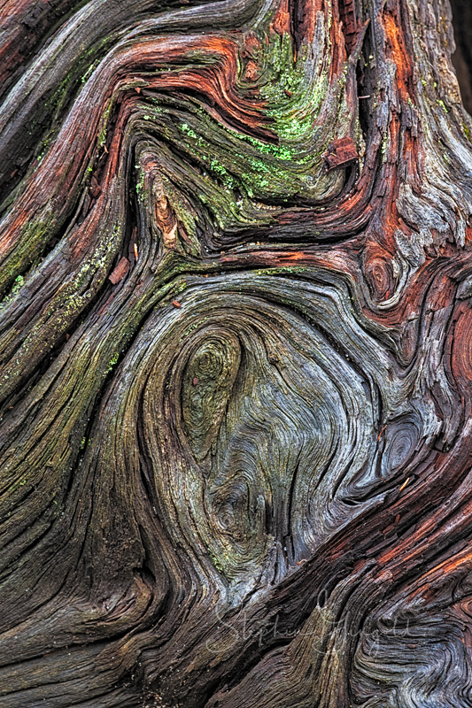
I wasn’t able to totally isolate the edge of the wood, but the shadowed interior gives it a nice border.

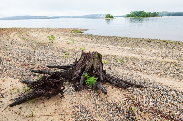
And, in case you are wondering, here’s the stump.

I am stumped by the beauty of the abstract patterns. Lacking a photographer’s eye, I probably would have only given the driftwood a passing glance. How much I would have missed!
LikeLiked by 1 person
It’s an easy thing to overlook and there are quite a few along the shore. When the reservoir was created I think stumps were just piled up and many remain.
Thanks, Ann.
LikeLiked by 1 person
I find this incredibly beautiful. The colors of nature just can’t be matched by the human hand. The swirls of the grain are gorgeous. I really love this photo.
LikeLiked by 1 person
Indeed, Nature is the ultimate artist. Of course, that is a bit of anthropomorphism since it takes a human to create and appreciate art but Nature’s handiwork is hard to surpass.
LikeLiked by 1 person
I really like these. If you told me there was a tree spirit trapped within, I’d think you had a point.
LikeLiked by 1 person
Sometimes it seems there are spirits everywhere. This stump certainly has more life in it than one might imagine. Thanks, Susan.
LikeLiked by 1 person
Happy abstract swirls to you. I wonder whether wooden swirls like those inspired Van Gogh.
LikeLiked by 2 people
It’s certainly possible that he drew upon memories of wood grain when he painted Starry Night.
LikeLike
That’s the painting I had in mind.
LikeLiked by 1 person
Your conversation reminded me of this article about turbulence, Starry Night, and artists’ use of patterns in nature. The similarities between the stump’s patterns and other forms of turbulence, from water to galaxies, is fascinating.
LikeLiked by 1 person
Thanks for the link to that article, Linda. It’s 4 a.m. and I can’t read it right now, but have saved it for later. I think all of us are affected in some way by what Nature presents to us and it is just natural for artists to take from those experiences. I think that many of the forces that create shapes and patterns are probably universal throughout all of creation from the stars to the effects of the tides on what is in their paths.
LikeLiked by 1 person
Great intricate patterns, beautiful.
LikeLiked by 1 person
Thank you, Robert.
LikeLike
Love it – love driftwood as well, but they are not to be found anymore around here.
LikeLiked by 1 person
People seem to like driftwood and I see it as yard decoration quite often. I prefer to leave things where I find them. Sorry you don’t get to enjoy it near your home any more.
LikeLike
NZ and Galápagos gave me the best memories of driftwood.
LikeLiked by 1 person
The visual exploration to define the exact right swirls must have been a wonderful exercise. These are remarkable images.
LikeLiked by 1 person
I did quite a few compositions of each then compared in LR to decide which angles and framing I preferred. It was very enjoyable making these images. And it was also a pleasant surprise since I had not thought at all about the stump although I had photographed it before.The unplanned is often the best.
Thanks, Michael.
LikeLiked by 2 people
Both the close-ups and the contextual views really appeal to me – beautiful! I’ve tried to photograph similar patterns in driftwood here and I’m usually not successful – harder than it looks!
LikeLiked by 1 person
I posted the contextual image last but, in reality, that was the first shot and was more about the shoreline wave effects. Obviously, there are not really tides here but the way the rocks are distributed up the shore makes it look that way. Mostly rising water levels and the wind.
I could post at least 5 different views of each but that would only show the different choices. In each case I chose what appealed to me the most. In both cases, despite the pleasing colors, it is the luminance of the greys, especially the second, that appeals toe most. Having the deep shadow next to the curved edge accents it. It is easy to capture too much or too little. I am trying to find more abstracts, so far rocks and stumps. 🙂
LikeLiked by 1 person
The luminance of the grays – yes, well put! And it’s true about the contrast, often not enough, or too much. Tricky. And I see the “tide marks” in the second photo, which add a lot. 🙂
LikeLiked by 1 person
Although I do not want to see a repeat of what created this image, I was thinking of it when I saw the sand/rock pattern.
Despite these being color images, I processed the files thinking of the description I once read of a good black and white development having a certain silvery quality (which made sense since silver was often an ingredient in the darkroom) and wanted to approach that with the grays.
LikeLike
That makes sense about silvery tones. I think of pewter sometimes too in black and white images – not used in developing (at least from the little I know!) but it describes that quiet sheen we like. 🙂
LikeLiked by 1 person
The colors are beautiful. The patterns remind me of burls; in fact, that’s what I thought they were at first. I see two figures in the center of the first photo: one human, one bird-like. They remind me of a William Blake illustration.
LikeLiked by 1 person
I see “The Scream” in the swirls of the first shot. I also thought they might have been small burls or else the creation of branch growth.
I was immediately drawn to the colors which I would guess were enhanced by the rain we had the night before. If I return on a dry day I will check to see how they’ve been muted when dried out.
LikeLiked by 1 person
Really fun, Steve, to see the close-ups and the stump. You did such a great job of bringing that old stump alive and sharing its beauty with us.
LikeLiked by 1 person
Thanks for following the link and commenting, Jet. I am glad you see the life in this old stump.
LikeLiked by 1 person